We’ve all seen those ‘10 worst logo designs’ listicles; some are harmless and funny, while others are downright PR nightmares. Don’t fret if you’ve never seen them, there’s at least one for every year.
But a crucial question remains unanswered: how can brands develop better logos?
A brand with a bad logo can face negative consequences, such as decreased brand recognition and loyalty, customer confusion, and – perhaps the most damaging of all – a tarnished brand image. Brand identity professionals are responsible for effectively communicating a brand’s values, mission, and offerings. Often, a poorly designed logo indicates a breakdown that occurred much earlier in the branding process.
To explain what brand identity agencies consider when designing logos, we’ll explain 2 overarching visual communication principles and how working with a brand identity agency (aka corporate identity agency) can help companies by creating well-designed logos that accurately represent their brands.
Legibility — Is the logo recognisable at a glance?
While legibility often refers to the ability to read and understand text-based materials, a legible logo is one that the audience can easily and quickly recognise – whether it’s the brand name, message, or other important information.
Clear and simple typography that’s easy to read at any size or distance is the name of the game here, as the size, weight, style, spacing, and contrast of the typeface have a big influence on how easy it is to recognise the words in a logo. Graphic designers with a good understanding of type anatomy will be able to customise type creatively to communicate the intended message effectively and leave a lasting impression on the viewer while keeping the logo legible.
Kia sparked a lively discussion on Reddit in 2022 when an anonymous user asked if anyone knows anything about a “KM” car. Turns out, the person had seen the Korean carmaker’s new logo on one of their new models.
We think Kia’s new logo is a much-needed refresh for the brand and appreciate what it tries to accomplish. There’s tremendous potential for the new logo to succeed the old logo smoothly, and it could be more recognisable with a touch of legibility improvements, especially when it is spotted from afar for a few seconds on the road.
Memorability and consistency — Does your logo (and its subsequent revisions) reinforce brand recall?
These are actually 2 separate design principles, but we’ll combine them to illustrate our point here.
A good logo design is memorable, leaving a positive and lasting impression on consumers. It should be unique, distinctive, easily recognisable, and doesn’t require major revisions to help to build brand recognition and recall.
Now, memorable logos aren’t built overnight; iconic brands spend decades building a relationship with customers through impactful advertising campaigns, a unique tone of voice, and messaging that is relevant to the audience it’s trying to reach. These positive experiences form a personal bond between the brand and its loyal customers that can withstand the test of time.
Revisions are necessary to keep the logo up-to-date aesthetically, but that should be all they are – improvements on what was already done well… which leads us to the principle of consistency.
When brands use and build upon their logos with consistency in mind, consumers will be able to recognise their logos with ease. By maintaining a similar type, color, and visual elements over the years, brands get to keep the goodwill and positive memories that they have formed with their consumers.
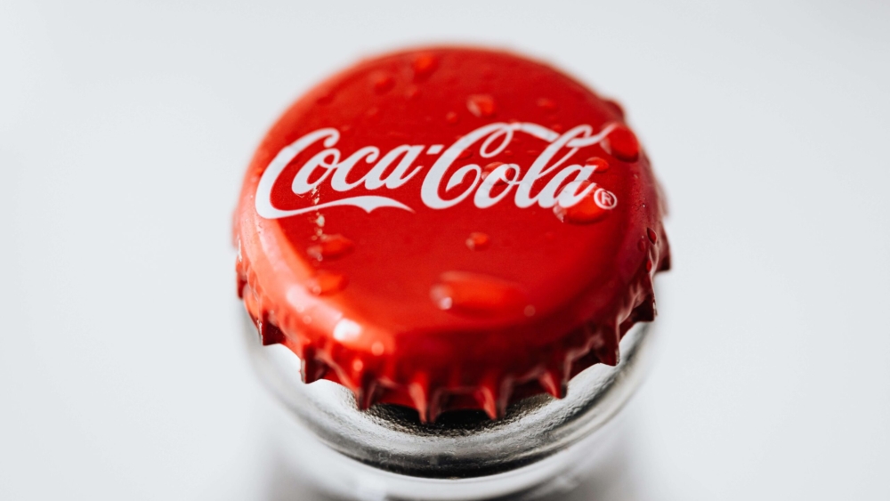
Coca-Cola is a classic example of logo memorability and consistency over multiple generations. As illustrated in the chart above, their logo has essentially remained the same since 1891, which is one of the contributing factors of its crowning as an iconic brand.
At this point you must be wondering, “Okay we get it, it’s a good idea to invest adequately when conducting a branding exercise with a brand identity agency. But why do they do a better job?”
Industry Expertise
Brand identity agencies (like us!) are the experts because of their exposure to a variety of clients. As a result, they have the experience and knowledge to ensure that your logo follows design industry standards, is scalable as your businesses grow, and ages well, even in a fast-paced landscape.
Brand Consistency
One of the biggest challenges of branding is actually what happens after everyone has signed off on an impeccable new logo design: consistency in application. An agency can create templates and guidelines to help businesses maintain a cohesive visual identity across different collateral applications.
Better Communication
As we have seen in the two case studies above, the vision and execution of a concept don’t always match up. Hiring corporate identity experts can help you clearly communicate your brand message and values through design that makes sense both on paper and in execution. Rest assured that as a common practice in our industry, every artwork gets examined rigorously by senior graphic designers, creative leads, art directors, account managers and creative directors before the client ever sees them.
So, to answer the question posed when we started this article: yes, businesses can get their logos right. But only when they have the right help.
And that’s something we’re more than happy to do here at Mutant. Reach out to us at [email protected].

