Good Design Is Invisible

Here’s a story you might be able to relate to:

You’re heading to the supermarket, telling yourself that you’re there to cross things off your shopping list and get out ASAP.

In the first five minutes, you’ve got what you came for. Bread, butter, milk? Check, check, check. Time to go. 

And then, it caught your attention. You stopped right in the middle of the aisle and made it hard for other shoppers to get around you, but it didn’t matter to you. 

This thing that stopped you dead in your tracks gave you a warm fuzzy feeling, and you loved it.

Before you knew it, you grabbed it and added it to your trolley, happy to spend the money on this thing you had no intention of buying. 

What could it be that held so much power over your decision-making process? 

The answer is good design. Allow us to explain.

Every step of your journey to the supermarket was designed. The concept of shopping in itself was a relatively new invention that rose to prominence as the middle-class emerged. Today, we shop without giving it any second thought. Shopping is like looking at our phones to unlock it, expensive dinners on Valentine’s Day, and buying a particular brand of milk even when all brands taste the same.

If you had known about this before, you would be able to stop yourself from such temptation, right? Inevitably a magician’s trick becomes its downfall when performed a second time.

Smart brands and their agencies know this. That is why they carefully craft their packaging to work in the shadows, hidden behind walls of short-term campaigns, paid and organic media, and new iterations of their products based on consumer data.

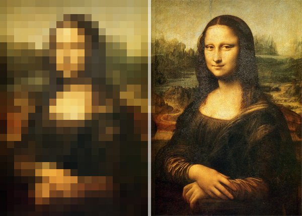
In other words, good design is invisible. It works best when you don’t even know why it works. But the same invisibility is also why businesses only realise its absence when sales are dropping or, “something just doesn’t feel right”. 

So, back to your intuitive purchase (not impulsive, we don’t like that word). What can you learn from this experience to apply it to your business? Let’s use the shopping experience as an analogy:

The Presentation Is The Message.

Looks do matter. As long as the product works as expected, most consumers will buy whatever looks best. A well-designed logo and packaging will help you sell far more than a DIY logo set in Comic Sans (yuck!). A competent agency will tell you what should go on your precious paid ads, and what shouldn’t. Many brands make the mistake of bombarding their consumers with facts that they can’t relate to, but smart brands? They say little, and the little they say is what prompts you to pull your wallet out.

Branding Is Selling

“Branding” is a term often used but rarely understood. It’s not about your fancy business cards or a sum of impressions – it’s your reputation and the gut feeling your consumers have at the mention of your brand’s name. Branding includes all of the aesthetic adjustments needed to appeal to them and an evaluation of your value proposition and why your current customers care. It’s not a cheap exercise, but if a $100,000 solution can solve your $10 million problem, wouldn’t you do it?

Positioning, Positioning, Positioning.

Source : Pexels

Positioning is the invisible force that turns your well-designed brand into a memorable one. That’s why smart companies like Nestle, Google, and Apple spend generously to craft earworm jingles, put their products on eye-level on supermarket shelves, and rent the biggest billboards right in the middle of New York City. The same companies also allocate vast chunks of their budget to tweak their communication materials every year to keep up with consumer trends. You win the game when you occupy mental and physical spaces.

So the next time you get that warm, fuzzy feeling when you look at a product, just remember that the invisible force tugging on your credit card is called “good design”. The entire experience is planned, and you can employ the same strategy with your business as well because, if you can’t win them, join them, right?

Want to make some “good design?” Talk to us at [email protected]

5 Design Tips To Make You Seem Like A Pro

Have you ever wondered if there’s a design cheat sheet somewhere to guide you on conveying your digital marketing materials effectively, and making things look prettier?

While there’s no magic answer to becoming a design whizz, there are quick tips and tricks to help you better design for online consumption (even if you’ve never been to art school). Luckily for you, us Mutants know a thing (or five) about designing great content: 

Have a purpose

Before we play dress-up, the ultimate goal is to tailor the form of your design to its purpose. Beyond defining your target audience and content strategy, be laser-focused in determining a clear CTA (call-to-action) for a successful acquisition – after all, a pretty design means nothing if it doesn’t connect to the action intended. It’s akin to completing a jigsaw puzzle when that last piece satisfyingly clicks into place. Remember, good design decisions are the result when your project goals are objectively met.

Maximise your layout

Always start with the relevant dimension to ensure your visual content is pixel-perfect. With the ever-changing social media landscape, knowing the right sizes is imperative to uphold your reputation. Depending on how much space you have, be mindful of information overload to ensure high visual prominence. Remember that the average person is not going to sit and focus on your content all day – it’s only a matter of seconds before they move on.

Command with hierarchy

Never underestimate the power of a well-structured visual hierarchy. By laying out information strategically, we are influencing users’ perceptions with various visual cues to help inform, impress and persuade. The most important elements on the page should be the largest.

Experiment with typography

If tone and manner captures the spirit of your voice, then typography works as the face of your character. But too much of a good thing can be bad – especially if you’re using a variety of display fonts to be ‘creative’. While it isn’t necessary to stick to one font, a trick that tends to be overlooked is mixing font variants (e.g. Helvetica Regular, and Helvetica Bold). Even though these fonts are in different weights, they appear consistent when used together because they’re from the same family.

Contrast with colour schemes

From monochromatic to eclectic colour combinations, determine the visual message of your piece and then stick to a colour palette to evoke your desired emotional response. Colour schemes are handy in defining the tone of your brand voice – be it harmonious or contrasting palettes, treat colours as an accent in your work to give emphasis and enhance aesthetics.

Still with us? Congratulations, you’re now a bona fide designer! Well, maybe not quite. While these considerations serve as a solid foundation for good design principles, sometimes you still need an eye for design to create compelling content using the power of visuals. 

Talk to us about your digital marketing plans at [email protected] – we’ll breathe life into it.

Steer Clear Of These Five Things When Working With A Designer

People employ designers for a variety of reasons: their company’s website requires a facelift, they need a hip logo for their book club, or they want to impress a client with cool infographics. Working with us designers can be a fun, seamless, and painless process…but only if you avoid committing these five cardinal sins:

Being vague with instructions and feedback

“Make it pop? Sure. By the way, I’ll be sending you an invoice for my mind reading services, too.”

Be as specific as possible when it comes to giving designers with instructions, direction or feedback on a project. Ambiguity isn’t going to help you achieve what you need, and will only leave the designer feeling stumped. To minimise frustration, be clear, direct and transparent when providing feedback to your designers. We are not psychic, and do not work well with meaningless phrases such as “make it pop” (how?), or “make this more yellow” (what kind of yellow?) or “this artwork is missing an X-factor” (What, exactly, is the X-factor for you?).

Designers are visual creatures, so use that to your advantage! It only takes a few minutes to throw together a mood board, which is a thematic collage that captures the essence of what you want the final artwork to look like. Attach examples of other projects in line with your vision so your designers can better ascertain the aesthetic you’re aiming for.

my-june-mood-board-for-farrowball-via-eclectic-trends

(Source: Electric Trends)

Getting your designer to work on non-editable files/low resolution images.

To effectively solve your business problems, we need tools that will help us get the job done. This includes assets such as working, editable files (think Adobe Creative Suite, not JPGs or PDFs), font files, text which can be copy-pasted and high-quality images (72 DPI for web and 300 PPI for print, as increasing the size of a low-resolution image would lead to pixelation) for efficiency. Heads up: screenshots and Microsoft Powerpoint or Word files do not count as design assets, as we cannot modify them.

(Source: Yearbook Machine)

Providing inadequate content

Designers are not magicians and cannot conjure artworks out of thin air. If you don’t provide assets or content for us to work with, you are setting everyone involved in the project up for failure. When giving us the design brief, it’s okay not to have all content in place. However, expecting the designers to rely solely on placeholder text and images to work with will only create the possibility of several rounds of re-design. If there is no finalised content, there can be no design.

On the other hand, dumping a mountain of content on us and expecting us to sift through the suitable parts will cause us to miss our deadlines, both internal and external. If you are the kind of person who expects work to be turned around quickly, make both our lives easier by providing us with the relevant, approved content so that there is minimal back-and-forth.

Expecting your designers to make changes instantly

The adage “good things come to those who wait” has never been more applicable. For the duration of the project, changes both major and minor are expected. However, expecting your designers to complete all edits in an hour is rather unreasonable.

Don’t underestimate the time needed to incorporate changes – even if the change seems simple to you, it may not actually be an easy fix. To save time, it is best to collate all edits and hand it over to your designer, and do try your best to keep the rounds of changes to a minimum. For everyone’s sanity.

Setting the deadlines without consulting the designer

The luxury of time is something we designers do not possess, as we are usually juggling multiple projects. If you give us unreasonable timelines, we will not be able to deliver. Procuring assets, loading files onto our digital workstations, conducting research and ideation, designing, editing, and testing digital platforms are time-consuming processes.

Never set a deadline without prior consultation with your designers. By having a chat about what’s an appropriate turn-around time expectations on both sides are adequately managed and no one will be disappointed.

Need a designer to whip up some beautiful artwork for your marketing campaign? Chat with us at [email protected]

7 Typography tips to ace your designs

Everyone’s had an idea for a cool design at some point. But turning your idea into reality is an effort. When it comes to creating graphics, it’s a different game. The application of graphic design is versatile and allows you to play around with shapes, images, positioning and typography. It’s a game you can get lost in.

The art of arranging type, aka typography, is not only a crucial part of any design, but also key to getting people interested in your design (and what you have to offer). A bad typography layout affects the readability, causing people to lose interest after reading just a first few lines. With millennials giving you less than 5 seconds to catch their attention, your typography needs to be spot on.

(Source: Harper’s Bazaar Brazil)

Failing to realise your idea visually, doesn’t always mean your idea was no good. Don’t question your ideas, but work on improving your designs. Here are some of the things to take note of when working on your next design project:

1) Choosing the right font (personality)

Are you aware that fonts have distinct moods and personalities? Don’t disregard Arial and Helvetica straight away. Always look at what you want to achieve before picking the font. Choosing the wrong font can convey different feelings and might even screw up your entire design.

For example, working on the design and layout for a fashion magazine, you most likely want to suggest modern, elegant and sophisticated tones – visually. You want to stay away from using Comic Sans or Papyrus fonts for the magazine, as it makes the entire design look unprofessional. The font you select needs to suit the personality of the brand.


(Source: AdWeek)

Never pick fonts just because you are awe of the particular typeface, in fact, you should choose the typefaces that suit your desired outcome.

“With millennials giving you less than 5 seconds to catch their attention, your typography needs to be spot on.”

2) No more than 3!

Never be generous with the use of fonts. Try to stick with one or two fonts for your design. Too many fonts might over-complicate the entire design – distracting the reader from what’s really important.

Remember websites in the 90s?

If you really want to use two to three different fonts in a design layout, avoid using fonts that look similar to each other (e.g. Bodoni and Didot). Visually similar fonts can be quite problematic, as they make your design look too indistinctive. Make it a family affair and use fonts from the same family, as it will give your design a more cohesive look. You might think that only one font looks boring, but ‘less is more’.

Let’s not forget, you can always play with the weights, styles and the width of the font. So, forget about the 90s and don’t use more than three fonts for one and the same design.

3) Do not stretch or squeeze! 

Stretching and squeezing a font is definitely a big no in the world of design. Many people are tempted and love to stretch and squeeze a font just to make it fit a certain space. Stretching and squeezing a font does not only look odd, it also makes your design, brand and you look unprofessional. Instead, try to increase the size of the font to make it fit.

4) Don’t forget to kern it


Kerning refers to adjusting the spacing between letters – and is different from adding gaps by hitting space on your keyboard (don’t even think about it).

(Source: AdWeek)

This is extremely important as it can make your design look a whole lot different. A good and bad design can be easily recognised and differentiated by just looking at the kerning. Hence, always remember to check the kerning before sending your final design to the client or the printer.

Nice smile, but that’s how you shouldn’t kern your design. (Source: Pixie Simms)

Mastering the art of kerning is especially important when it comes to creating your own font from scratch. Check out typemethod and practice your kerning skills until you get the hang of how it works.

5) Wipe out all the widows and orphans

If you don’t know what that means, you definitely need to pay attention now. Not many people will notice and identify the typographical widows and orphans. But if you want to tighten up your graphic designs you better start taking notice.

In the design world, a widow is a word that is left dangling at the end or the bottom of a paragraph, separated from the rest of the paragraph. While an orphan is a short paragraph that appears at the beginning of a column or page. One of the easiest ways to eliminate them is to rewrite or change the line ending. Another alternative is to manually edit the text or bring the text down to the next line.

6) The ‘ideal’ line width

Easily overlooked, a design’s line width is of importance too, playing a crucial role in the readability of the text. Wide columns usually won’t do your design any good, as they break the flow of the reader’s eyes when they jump from one line to the next. On the other hand, a narrow column might annoy your reader. Finding the balance is key to making it easy for the reader’s eyes to get through the article or text. Remember – the reader should be fully taken in by the content and not be distracted by the layout.

Never try to fit in all the words onto one line, as it might screw up the readability of your article. The perfect solution to a balanced line width is to keep it short. About 8 to 10 words or 50 to 60 characters per line is ideal.

7) Create a visual hierarchy

Think of what you want your viewers to look at first – only then you can embark on a design project. Everyone wants to create a design that looks good and captures people’s attention at a glance – so, make sure you don’t distract them with unnecessary stuff. Hierarchy plays an important role in design. It creates a flow, directs your eyes and allows your brain to process it easily. Hierarchy makes it easier for the viewer to distinguish what content comes first.

(Source: Pinterest)

You can learn how to establish a visual hierarchy by reading newspapers and magazines. Alternatively, you can try to play with the size, weight and spacing to achieve a visual hierarchy in your design. The more you practice, the more you will train your eyes.

Want sharp designs? Need to visualise an idea? Drop a message to [email protected] 

How to create presentations that don’t suck

We’ve all been subjected to sitting through boring work presentations. You know, the ones we don’t pay attention to because they’re so dull it’s actually painful.

Unfortunately, it happens way too often – from sales pitches, to company roundups, to product launches and more… the boredom is real!

Just because the presentation is internal, or is on a less-than-exciting topic, doesn’t mean you have to create one lacking in stimulation or areas for engagement. Humans are visual creatures with shortening attention spans – snore-inducing content just won’t cut it.

So how can you ensure you don’t lose your audience? It doesn’t require you to be a technical or design whiz, it simply means you need to think outside the very boring PowerPoint box.

Here are a few quick tips to whip your next presentation into shape:

  1. Less is more

It’s all about the economy of words! You might think you’re coming across smarter and more professional with those long-winded sentences and ridiculous jargon, but all you’re doing is giving your viewers a reason to switch off.

You need your audience to understand and process the information you’re presenting – do you think that’s likely to happen when you share an essay? Stick to quick bullet points, catchphrases, keywords and short sentences. Your slides shouldn’t exhibit your entire presentation word-for-word; it should be the highlight reel.

  1. Get creative with it

How dull are templates? Why do they even exist? Avoid subjecting yourself to the standard– even when you have branding guidelines to adhere to. This is YOUR canvas, so try to have a little bit of fun and add some life into your presentation.

Find engaging colours and create layouts that are fun and different to help get your message across. Don’t go overboard with your creative license, but do take a step back before ask yourself, “am I excited by this presentation?”

  1. Infographics for the win

All rejoice for the beloved hybrid of information and graphics – the humble infographic! These designs are a godsend for any presentation, bringing plain text to life and helping to accentuate otherwise complex data and statistics.

An infographic allows your audience to better digest information, meaning they can spend more time actually listening to you, rather than trying to read blocks of text. Beautifully designed icons, graphics and copy can really take your presentation from boring to brilliant.

  1. A picture paints a thousand words

Heck, sometimes you don’t even need text. Create intrigue, elicit laughter, and make a point stick by using clever images, memes, gifs or photos to make a point. As well as being entertaining, imagery can help break up the presentation.

If you must add text as well, then do, but try to use images that help weave your story together on their own.

So, there you have it! Snorefest no more – now your next presentation will be a true masterpiece.

Stuck for content and need a little life injected into your copy? Our Words team can help turn your content from drab to fab. Get in touch at [email protected].


Order compelling content