Why More Brands Should Jump On The Livestreaming Bandwagon

In 2019, Singles Day broke all retail records with sales hitting more than $38 billion in the 24 hour period. In fact, merchants and brands participating in the online retail festival earned as much as 20 billion USD from livestreaming alone, selling furniture, apparel, beauty, and consumer electronics.

Livestreaming’s roots can be traced back to live television shopping shows such as QVC and Home Shopping Network, where people could shop for, well, anything under the sun. The faces of these shows were enthusiastic individuals who hoped to make the audience believe in the brand and product. Decades later, we have influencers, actors and other social media stars doing the same thing – only this time, we get to carry them around in our palms and pockets.

In China, livestreaming has become a source of entertainment, with many brands and influencers using it as a tool to launch and quickly sell their products. On livestreaming platforms such as ShopShops, luxury brands and independent re-sellers alike have found themselves a dedicated audience that is quick to lap up their offerings.

But just because a bunch of brands are jumping on the livestream bandwagon, should you? Here are some compelling reasons:

To woo your Gen-Z audience 

Young audiences want quality content at their fingertips, and they want it now. Tune in to Instagram, Facebook, Twitch, Periscope – any platform which facilitates livestreaming and it’s easy to see why.

The scope for consumer engagement and interaction is unlimited – people can ask questions, make purchases, receive updates on their favourite brands or insider information about exclusive launches, and send the host love and appreciation in the form of react buttons and stickers. What’s more, all of this occurs in real-time on people’s handphones.

Beauty brands favoured by millennials, such as Fenty Beauty, Glossier and Sephora have been innovating with their usage of livestreams, where they regularly invite influencers, makeup artists and celebrities to create looks and conduct tutorials. Rihanna herself has regularly taken to livestreaming to promote and educate consumers about the latest products.

To showcase your brand and start a conversation

Why fork out precious marketing dollars for a promotional video campaign, when you can just as easily and effectively leverage live-streaming at a lower cost, and ensure that you reach a wider audience. With livestreaming, you can kickstart a long-lasting conversation with fans and customers, and build credibility by having professionals display and vouch for the quality of the products.

Announcing new products and offering exclusive packages and deals during a livestream is also an excellent way to gauge demand for it.  However, live-streams should be more than simply getting your product to fly off the shelves. You want to connect with people emotionally so they keep coming back to watch you.

To increase authenticity

There is also something inherently raw and realistic about live-streaming, which comes across as intimate and authentic to fans. While polished video campaigns highlighting new products in detail are undoubtedly appealing, the spontaneous and uninhibited nature of a live-stream draws in people easily.  

There is no scope for editing, deleting or revising parts of the content — all the action unfolds before the viewer’s eyes. Sometimes, live-streams do not even need to be in a professional studio with perfect lighting. Influencers and indie brands will often film a session from the comfort of their homes. This makes viewers feel as though they are being included in the private world of an Internet personality.

As a brand, you would want to make yourself accessible to customers at all times. Why not turn to a tool which will help you reach a wider audience, and lend you the visibility to grow?

Want to make livestreaming a part of your media strategy? Write in to [email protected] and we’ll make it happen!


#MutantsTakePhuket: Team Retreat to Phuket!

Sometimes you’ve got to say ‘Phuket, let’s go to Phuket’ 😉

A private villa, a schedule of exciting team challenges, and heaps of Thai food – us Mutants were whisked away to Phuket this February for our annual Mutant Offsite. Yep, we’re lucky enough that for three days every year, our entire team heads out of Singapore for a teambuilding experience like no other. And after a rather big and busy 2018, we wanted to kick off this year with a bang. Phuket seemed to be the obvious choice for a company retreat.

After an hour’s ride from the airport, we arrived at our accommodation near the peaceful Nai Harn Beach, seemingly a world away from the usual Patong haunts.

  
This tucked-away bungalow villa can house up to 32 guests, and has two swimming pools! | Photo by: Sreya Sanyal

Work first, then pool time? Thai and stop us… | Photo by: Ian Lee


The view from one of the rooms in the villa. | Photo by: Yeo Sze-G


A living space with an abundance of plants is definitely #goals. | Photo by: Claire Choo

Shark Tank (minus Kevin O’Leary)

After everyone settled in (and dried off from a dip in the pool with a gigantic blow-up rainbow unicorn), we were given our first task of the trip – after all, what’s a team retreat without some mind-boggling team challenges?


Our CEO, Joe, recapping company performance in 2018 before the mini challenge began | Photo: Yeo Sze-G

After being split into teams, the challenge was to choose an item that could be found in the villa and pitch it, with just 15 minutes’ prep time. We had to come up with a name for our product, its target audience, a tagline, and an elevator pitch to a bunch of ‘investors’ (our bosses). From a vertical garden to the humble toilet roll, the exercise was all about being bold and thinking out of the box.


Team Towel-In-Oneturned an ordinary orange beach towel a convertible garment. | Photo: Rebecca Lewis

Team Lifeline: The winners for our first challenge made toilet paper a must-have accessory! | Photo: Rebecca Lewis

The winner from the first challenge was Team ‘Lifeline’, who pitched customisable toilet roll. It was a close call between teams, but their creativity, humour and solid pitching skills ultimately won the challenge.

“It was great getting to know more about my colleagues outside an office setting, and it was also refreshing teaming up with people I don’t usually work with during the challenges,” said Alyson, our Senior Account Executive.

Mutant’s Storytelling Challenge

The second day in Phuket was all about storytelling, and an exercise that focused on creating visual narratives for a specific audience. We were again split into teams, and then tasked with finding an underrated place in Phuket, travelling there, scripting a video and then editing a two-minute piece to present to everyone – all in about 5 hours’ time! Talk about meeting tough deadlines…

  1. Getting a Thai massage fix


Photos: Alyson Tay, Bethany Bloch, Ian Lee, Tina Sales

Our first team explored the world of Thai massage on the island. Profiling a pop-up stall on the beach and a massage studio in a strip mall, they taught us all about the art of benefits of a traditional Thai massage and emphasised that you don’t need to go to a ritzy resort for a high-quality experience.

  1. Exploring a living museum


Photos: Kent Toh, Richa Shah, Yeo Sze-G

With team member Kent as the main lead in their video, Team 2 headed to Baan Chinpracha Museumin Old Phuket Town, and told us the history of Chinese culture in Phuket through the rustic imagery of a 100-year-old house that was built by a wealthy Chinese family in the early 1900s.

  1. Being #Basic


Photos: Ivan Tan, Priscillia Chun, Sreya Sanyal

Team 3 gave us the ultimate guide to having some #summertimegladness on the streets of Old Phuket Town. They showed us where we could go to live our best Instagram life by introducing trendy clothing stores and the coolest cafés in the area.

  1. Patong by day


Photos: Claire Choo, Rhea Arora

Reporting from the sands of the most (in)famous nightlife hotspot in Phuket, Team 4 demonstrated why the area is worth a daytime visit, highlighting where to eat, shop and play.

“This challenge was all about emphasising the soft skills required for collaborative storytelling and meshing different perspectives and angles into a coherent narrative. Some of us are lifestyle-y sorts while others are corporate-y data people, so emotive storytellers and data storytellers were able to come together to create these videos,” said Ian, our Account Manager.

Putting the “treat” in “retreat”


While some of us had fun in the sun… | Photos: Alyson Tay, Ian Lee

…others experienced a bit of discomfort. But the good kind – who doesn’t love a good
Thai massage? | Photos: Alyson Tay, Ian Lee

After all the brainstorming and sun exposure, we made sure to unwind the best way we know how: with good, local food. Nai Harn still retains its quiet charm with only a few hotels and villas in the area, and authentic local restaurants dot the shore.


We made sure not to miss out on the classic pineapple fried rice! | Photo: Yeo Sze-G


Our outdoor dinner setting on the last night | Photo: Bethany Bloch


It was a feast! | Photo: Alyson Tay

We had a great time bonding over delicious food, fun challenges and convenience store snack and beverage runs. Sometimes, to relieve stress from hectic work schedules and deadlines, you just need to get everyone out of the office to relax and have fun!

A 360 team photo at Nai Harn Beach | Photo: Ian Lee

“It was time well spent. We don’t only work hard, but we play hard, too,” said Kent, our Business Development Executive.

Refreshed and reinvigorated, we Mutants are back in the office – though perhaps daydreaming every now and then about green curry in our bellies and sand between our toes.

Want to know about the other cool stuff we do while having fun? Contact us at [email protected].

Steer Clear Of These Five Things When Working With A Designer

People employ designers for a variety of reasons: their company’s website requires a facelift, they need a hip logo for their book club, or they want to impress a client with cool infographics. Working with us designers can be a fun, seamless, and painless process…but only if you avoid committing these five cardinal sins:

Being vague with instructions and feedback

“Make it pop? Sure. By the way, I’ll be sending you an invoice for my mind reading services, too.”

Be as specific as possible when it comes to giving designers with instructions, direction or feedback on a project. Ambiguity isn’t going to help you achieve what you need, and will only leave the designer feeling stumped. To minimise frustration, be clear, direct and transparent when providing feedback to your designers. We are not psychic, and do not work well with meaningless phrases such as “make it pop” (how?), or “make this more yellow” (what kind of yellow?) or “this artwork is missing an X-factor” (What, exactly, is the X-factor for you?).

Designers are visual creatures, so use that to your advantage! It only takes a few minutes to throw together a mood board, which is a thematic collage that captures the essence of what you want the final artwork to look like. Attach examples of other projects in line with your vision so your designers can better ascertain the aesthetic you’re aiming for.

my-june-mood-board-for-farrowball-via-eclectic-trends

(Source: Electric Trends)

Getting your designer to work on non-editable files/low resolution images.

To effectively solve your business problems, we need tools that will help us get the job done. This includes assets such as working, editable files (think Adobe Creative Suite, not JPGs or PDFs), font files, text which can be copy-pasted and high-quality images (72 DPI for web and 300 PPI for print, as increasing the size of a low-resolution image would lead to pixelation) for efficiency. Heads up: screenshots and Microsoft Powerpoint or Word files do not count as design assets, as we cannot modify them.

(Source: Yearbook Machine)

Providing inadequate content

Designers are not magicians and cannot conjure artworks out of thin air. If you don’t provide assets or content for us to work with, you are setting everyone involved in the project up for failure. When giving us the design brief, it’s okay not to have all content in place. However, expecting the designers to rely solely on placeholder text and images to work with will only create the possibility of several rounds of re-design. If there is no finalised content, there can be no design.

On the other hand, dumping a mountain of content on us and expecting us to sift through the suitable parts will cause us to miss our deadlines, both internal and external. If you are the kind of person who expects work to be turned around quickly, make both our lives easier by providing us with the relevant, approved content so that there is minimal back-and-forth.

Expecting your designers to make changes instantly

The adage “good things come to those who wait” has never been more applicable. For the duration of the project, changes both major and minor are expected. However, expecting your designers to complete all edits in an hour is rather unreasonable.

Don’t underestimate the time needed to incorporate changes – even if the change seems simple to you, it may not actually be an easy fix. To save time, it is best to collate all edits and hand it over to your designer, and do try your best to keep the rounds of changes to a minimum. For everyone’s sanity.

Setting the deadlines without consulting the designer

The luxury of time is something we designers do not possess, as we are usually juggling multiple projects. If you give us unreasonable timelines, we will not be able to deliver. Procuring assets, loading files onto our digital workstations, conducting research and ideation, designing, editing, and testing digital platforms are time-consuming processes.

Never set a deadline without prior consultation with your designers. By having a chat about what’s an appropriate turn-around time expectations on both sides are adequately managed and no one will be disappointed.

Need a designer to whip up some beautiful artwork for your marketing campaign? Chat with us at [email protected]

Tips on using PR to build a brand for small businesses

For most small businesses with limited resources, public relations tend to be overlooked as a viable business strategy.. However, an effective public relations strategy can be incredibly valuable. In many cases, it is a cost effective way of getting your brand out there and building a strong reputation without the expensive cost of traditional advertising.

So, if you run a small business, consider these tips  to get the right kind of attention your brand needs – all without breaking the bank:

Find the right people

Journalists are constantly getting emails with story pitches that don’t often relate to their beat. To cut through the clutter, make sure what you are sending their way is relevant to their publication, and what they cover.

Do your research to find out who you should be targeting, and spend time understanding their publication. Reading what journalists are currently tracking and covering is a good starting point in building a media list. Remember, journalists who are already interested in the space you’re in are more likely to publish what you have to say.

Know what the media needs

Sure, your story is important to you, but is it newsworthy? The key to a well-written press release is not imbuing it with flowery language; it’s nailing down a compelling news angle and getting straight to the point. Journalists are often on the go just like you, so go with a punchy headline to grab the journalist’s attention, and keep it short and sweet.

Strike while the iron is hot

Sometimes, tying your announcement in with a timely moment can help give it an extra boost through that connection. If you’re launching a new product, do a bit of research to find out if there are any upcoming events, occasions or even trending topics that are relevant to your product. Use a recent trending topic that is linked directly to features of your business or business model. For instance, McDonalds struck gold with their nasi lemak-inspired burger by launching it ahead of Singapore’s 50th National Service anniversary. A clever spin on a classic dish, the burger was a massive hit thanks to its local appeal and opportune release date.  Connecting the two can enable you to tap on that trending issue.

Communicate your expertise

Even as a small business owner, you are still an authority in your field. Communicate that expertise by positioning yourself as an expert in the industry, and build yourself up as a thought leader with a story to tell the media. There’s always a story to tell, you’ve just got to find the right angle to communicate it. The key here is to step out of living and breathing your product. Showing thought leadership requires you to go beyond just how amazing your product is. You will have to demonstrate your understanding on the issues faced by your target audience and how you can solve them.

Make it visual

In today’s multiscreen world, people respond well to visuals. If you’re pitching a story involving data and numbers, putting them into one neat infographic can bring your story to life. You will be surprised at how much a good image can enhance your press release or media kit. It is definitely worth the investment to have a professional come in to take pictures of your products and spokespeople.

Getting your brand off the ground when you’re running a lean operation may be a daunting task, but when done right, an effective PR campaign tailored to the needs of your small business can do wonders – even with limited resources.

Need a helping hand on getting your brand and voice out there? Reach out to [email protected]

7 Typography tips to ace your designs

Everyone’s had an idea for a cool design at some point. But turning your idea into reality is an effort. When it comes to creating graphics, it’s a different game. The application of graphic design is versatile and allows you to play around with shapes, images, positioning and typography. It’s a game you can get lost in.

The art of arranging type, aka typography, is not only a crucial part of any design, but also key to getting people interested in your design (and what you have to offer). A bad typography layout affects the readability, causing people to lose interest after reading just a first few lines. With millennials giving you less than 5 seconds to catch their attention, your typography needs to be spot on.

(Source: Harper’s Bazaar Brazil)

Failing to realise your idea visually, doesn’t always mean your idea was no good. Don’t question your ideas, but work on improving your designs. Here are some of the things to take note of when working on your next design project:

1) Choosing the right font (personality)

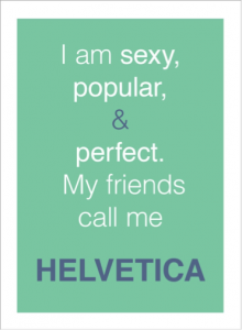
Are you aware that fonts have distinct moods and personalities? Don’t disregard Arial and Helvetica straight away. Always look at what you want to achieve before picking the font. Choosing the wrong font can convey different feelings and might even screw up your entire design.

For example, working on the design and layout for a fashion magazine, you most likely want to suggest modern, elegant and sophisticated tones – visually. You want to stay away from using Comic Sans or Papyrus fonts for the magazine, as it makes the entire design look unprofessional. The font you select needs to suit the personality of the brand.


(Source: AdWeek)

Never pick fonts just because you are awe of the particular typeface, in fact, you should choose the typefaces that suit your desired outcome.

“With millennials giving you less than 5 seconds to catch their attention, your typography needs to be spot on.”

2) No more than 3!

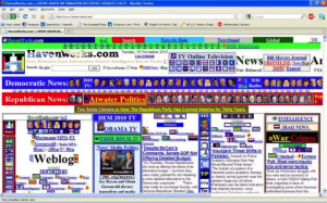
Never be generous with the use of fonts. Try to stick with one or two fonts for your design. Too many fonts might over-complicate the entire design – distracting the reader from what’s really important.

Remember websites in the 90s?

If you really want to use two to three different fonts in a design layout, avoid using fonts that look similar to each other (e.g. Bodoni and Didot). Visually similar fonts can be quite problematic, as they make your design look too indistinctive. Make it a family affair and use fonts from the same family, as it will give your design a more cohesive look. You might think that only one font looks boring, but ‘less is more’.

Let’s not forget, you can always play with the weights, styles and the width of the font. So, forget about the 90s and don’t use more than three fonts for one and the same design.

3) Do not stretch or squeeze! 

Stretching and squeezing a font is definitely a big no in the world of design. Many people are tempted and love to stretch and squeeze a font just to make it fit a certain space. Stretching and squeezing a font does not only look odd, it also makes your design, brand and you look unprofessional. Instead, try to increase the size of the font to make it fit.

4) Don’t forget to kern it


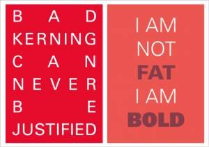
Kerning refers to adjusting the spacing between letters – and is different from adding gaps by hitting space on your keyboard (don’t even think about it).

(Source: AdWeek)

This is extremely important as it can make your design look a whole lot different. A good and bad design can be easily recognised and differentiated by just looking at the kerning. Hence, always remember to check the kerning before sending your final design to the client or the printer.

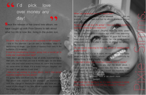
Nice smile, but that’s how you shouldn’t kern your design. (Source: Pixie Simms)

Mastering the art of kerning is especially important when it comes to creating your own font from scratch. Check out typemethod and practice your kerning skills until you get the hang of how it works.

5) Wipe out all the widows and orphans

If you don’t know what that means, you definitely need to pay attention now. Not many people will notice and identify the typographical widows and orphans. But if you want to tighten up your graphic designs you better start taking notice.

In the design world, a widow is a word that is left dangling at the end or the bottom of a paragraph, separated from the rest of the paragraph. While an orphan is a short paragraph that appears at the beginning of a column or page. One of the easiest ways to eliminate them is to rewrite or change the line ending. Another alternative is to manually edit the text or bring the text down to the next line.

6) The ‘ideal’ line width

Easily overlooked, a design’s line width is of importance too, playing a crucial role in the readability of the text. Wide columns usually won’t do your design any good, as they break the flow of the reader’s eyes when they jump from one line to the next. On the other hand, a narrow column might annoy your reader. Finding the balance is key to making it easy for the reader’s eyes to get through the article or text. Remember – the reader should be fully taken in by the content and not be distracted by the layout.

Never try to fit in all the words onto one line, as it might screw up the readability of your article. The perfect solution to a balanced line width is to keep it short. About 8 to 10 words or 50 to 60 characters per line is ideal.

7) Create a visual hierarchy

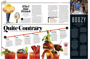
Think of what you want your viewers to look at first – only then you can embark on a design project. Everyone wants to create a design that looks good and captures people’s attention at a glance – so, make sure you don’t distract them with unnecessary stuff. Hierarchy plays an important role in design. It creates a flow, directs your eyes and allows your brain to process it easily. Hierarchy makes it easier for the viewer to distinguish what content comes first.

(Source: Pinterest)

You can learn how to establish a visual hierarchy by reading newspapers and magazines. Alternatively, you can try to play with the size, weight and spacing to achieve a visual hierarchy in your design. The more you practice, the more you will train your eyes.

Want sharp designs? Need to visualise an idea? Drop a message to [email protected] 

How to use visual content

It’s the age of the visual culture which means more visual content. With shortening attention spans, marketers and content creators have to constantly think of new ways to capture our attention. According to an article published by Hubspot this year, coloured visuals increase willingness to read a piece of content by 80%.

You’re definitely on the right track if you’ve been integrating visuals into your content strategy, but when does an image work better over a video?, or a GIF over an image?

Images

With social networks becoming increasingly image-centric, it shouldn’t come as a surprise that brands should be including high-definition images in their marketing mix. Images are visually-captivating and easily shareable.

When should I use images?

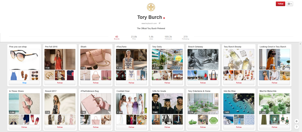
Besides images being easily shareable on social media platforms like Facebook and Instagram, Pinterest is another brilliant image-sharing medium with 100 million daily active users. The shift to visual content is clearly emulated here as brands can ‘pin’ beautifully captured images to their ‘boards’.

Tory Burch, an international fashion brand, has had success in marketing their products through images on Pinterest. With almost 200,000 followers, the brand’s images on Pinterest are carefully curated and categorised.

Example of Tory Burch Pinterest success

GIFs

Remember the moving photos in photo-frames and newspapers in the hit movie series, Harry Potter? Well, the brilliant invention of the GIF brought us a step closer to the wizarding world! GIFs are the hybrid between images and videos. They move, of course, but they’re not as lengthy as videos. Because they’re short and have no sound attached to them, GIFs are easy to digest. A GIF typically focuses on a specific moment in a larger picture. GIFs are also cheaper to produce than videos and take up less resources.

When should I use GIFs?

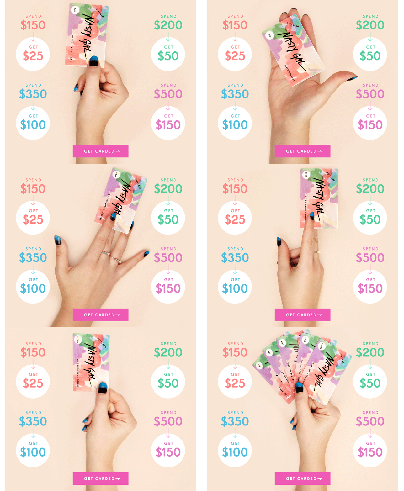
GIFs work best in e-newsletters. They are quirky and provide marketers with the opportunity to draw attention to specific products. Here is an example from an email sent out by NastyGal, an online clothing store, to promote their gift card:

Sample of gift card giveaway from Nasty Gurl

Videos

According to a report published by Cisco, video will account for 69% of all consumer internet traffic by 2017. You don’t need a host site like YouTube to publish videos because you can now post directly to social media sites like Facebook and Instagram. These platforms have become more video-friendly, with Facebook pushing out Facebook 360 and Instagram allowing longer video posts.

When should I use videos?

Videos are great pieces of marketing and allow brands to tell their stories in more comeplling ways. A video is more immersive and offers viewers a more engaging experience. With YouTube amassing 4 billion daily views, your brand’s online reach is endless. Always consider the audience you are trying to reach out to and make sure you get your message across articulately. Creativity is a must! GoPro’s YouTube channel has more than 4 million subscribers. What makes the brand so popular? Their videos are cleverly grouped into several categories that showcase the different uses of its main product. Here is an example:


It’s great to integrate images, GIFs and videos into your content marketing strategy but remember not to overdo it. The last thing you want is to overwhelm people and have them flag your content as spam.

Get in touch with us at [email protected] for all your content needs.

Order compelling content

How to create killer content

Do you wonder if your marketing budget is being spent in the right places? Or whether your dollars are delivering maximum ROI? Content marketing has far surpassed traditional advertising in today’s social-media driven world. Viewers channel-hop during television commercials and ignore ad placements in newspapers and magazines. Instead, they actively seek out content they are interested in.

With the human attention span getting shorter by the minute, the competition for audience attention is intense. How exactly do you set your writing apart from the increasingly saturated blogosphere of content?

Use compelling titles

People scan more than they read. A huge wall of text often turns readers off and you’ll find them scrolling past your content in a jiffy. Your title represents your content on keyword searches and social media. It practically sells it and 8 out of 10 readers today don’t look past post titles. With an interesting title, you are more likely to attract your audience to at least scan through your words. Include subheadings that stand out so that your readers have an idea of what to expect next.

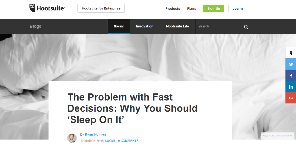
Here is a an example from Hootsuit of a great headline:

Creative content headlines

Be consistent

It isn’t enough to merely schedule your content for a couple of times a week. Sure, that is consistent frequency, but the key to retaining your readers and attracting them to read post after post comes down to a lot more than just timing. Your tone should be streamlined across each platform you utilise to engage with your audience. To leave a lasting impression, you’d want to give your brand a unique personality. Start off with an overall content strategy and consolidate a fixed tone in order to set the foundation.

Go visual

As mentioned earlier, readers often switch off when they face a wall of text. Imagine scrolling through paragraphs of Times New Roman size 12 font (boring right?!) and then something colourful catches your eye. Of course you would stop to look. Not only do visuals help to illustrate your content, but statistics show that visual content is processed 60,000 times faster in the brain as compared to text. Integrate colourful infographics and videos when you’re creating your content to increase the chances of getting your content read.

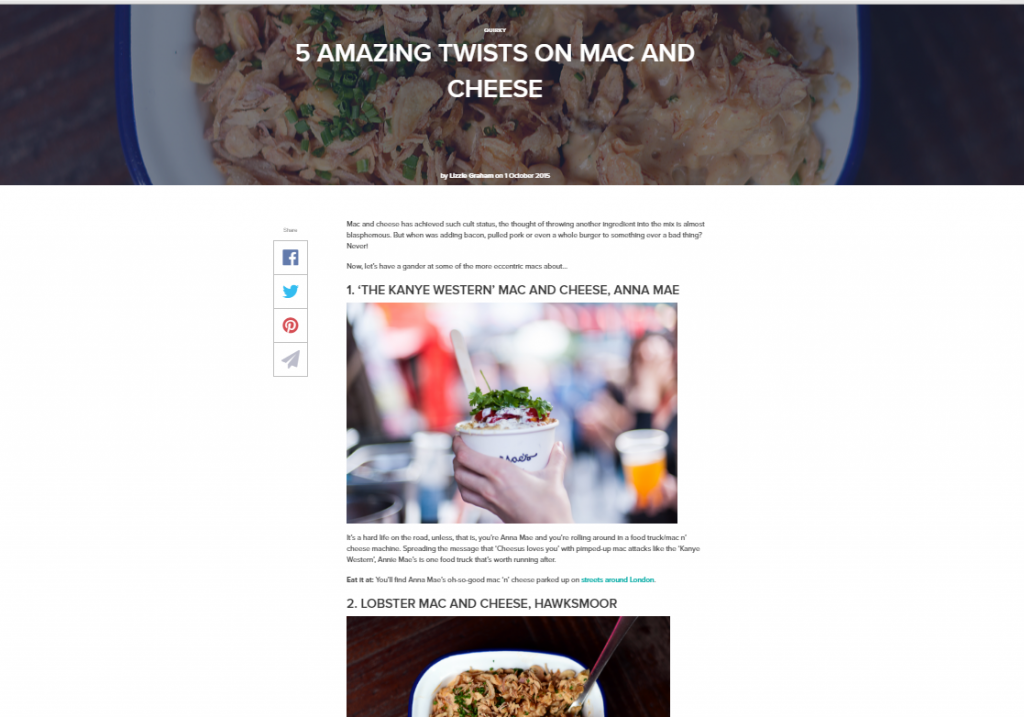
Here’s a great example from Deliveroo. They have provided mouth-watering mac and cheese images that makes reading the content a whole lot more exciting –Who’s hungry?

Creative visual content in blog


Involve your audience

Engage your readers by speaking directly to them through your content. Posts need to be relatable and readers should never feel detached from the narrative. You can also leave your readers with questions and perhaps address them in the next post. Your content should ideally spark a wave of comments, increasing its reach to a wider audience.

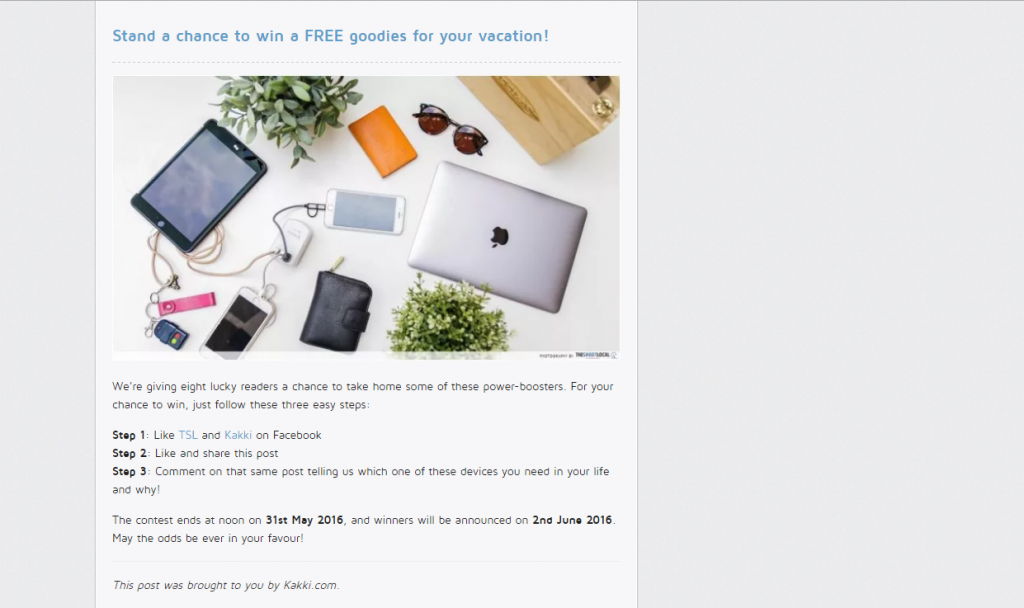
Check out this great example from The Smart Local:

Engaging content for social media


Take your sales hat off

Today’s tech-savvy consumers are so used to viewing content that promotes a branded products and services they are practically immune to direct sales. Aggressive overselling only turns potential consumers away because the more you try to sell, the less interested they become. Instead, focus on building your voice and influence within the industry. Be genuine and convey your ideas directly in your content. This not only creates a brand impression in the eyes of your readers, but interests them to patronise your content because they know that there will be no hard-selling involved.

Adidas has nailed it. The article has no mention of buying Adidas clothing but indirectly implies fit parents need cool workout gear. (If you have’t got it, they want you to go buy Adidas workout gear!)

conversational and informative content

Content marketing is a powerful way for businesses to reach out to their target audience. The best kind of content is captivating, makes audience want to continue reading and most importantly, makes them want to share it on their social media platforms. Don’t forget to leave a call-to-action to guide your readers on what to do next!

Need help nailing your next content piece? Get in touch with us at [email protected].

Order compelling content

What is the meaning of content?

Ok, so I’ll be the first to admit words and phrases like ‘content’ and ‘content marketing’ are becoming overused. Every one claims to be doing it, but very few people really understand what all that fancy lingo means and, more importantly, how to use it properly to get the desired results.

I’m here to run you through some of the more common terms, from buyer personas to visual content.

Buyer Personas

Buyer personas are fictitious characters that represent an accurate snap shot of your target audience. Knowing your audience, and understanding their needs is key to the success of any content marketing campaign. Take the time to identify whom you are targeting and develop your content ideas from there.

Calls-to-Action

Remember this term, as this is a vital addition to your content marketing. This little button (or link, or whatever you choose to use) is the key to converting site traffic into leads. It’s generally displayed in the form of a “download now” or “click here” action button, but this little beauty doesn’t always need to be focused on lead generation. It can also be a link to social media, or an external link or an email. Whatever you choose, just make sure it’s relevant to the content piece.

E-books

What’s an e-book I hear you ask? Well, the best way to describe an e-book is an extended piece of content that explains a topic in more depth. The blog posts you write should be short snippets about different aspects of one topic. Think of your blog posts as individual chapters in a novel, and the e-book is the novel. It’s combining everything into one detailed piece of content that educates and inspires the reader.

Editorial Calendar

Every content strategy should be accompanied by en editorial calendar. This is your planner and the road map for all content creation. It will help you develop your ‘story’ and put together the topics you wish to cover – and of course which buyer personas the content is targeting.

Keywords

Basically a keyword is something a user types into a search engine to find information about a particular topic. Content marketers should understand which keywords their target audience favours, and front-load them across the content they produce. All this should also tie in with your SEO campaign to get the most bang for your buck.

Newsjacking

This is a tricky one that not many people really understand. Simply put, Newsjacking is a practice of making the most out of recent and highly popular news. I don’t’ mean report on the fact that Kim Kardashian broke the Internet with her nude photoshoot. No – that’s going to be covered a lot anyway, and really… who cares! I’m talking about putting your own spin on it. So, for example if you are a social media agency, talk about how this impacted Instagram or what that means for brands.

Remember that all your content should be useful to YOUR target audience. Oh and if you are quick enough to capitalise on popular news, Google will reward you and bump the ranking of your story.

Visual Content

With so many words and our limited attention span, visual content is fast becoming the cool kid on the block. Here, I’m referring to images, infographics and videos, which are crucial to capturing the attention of the time poor consumer, and really get them to engage with your brand.

I hope this was helpful and gave you a deeper insight into the powerful world of content marketing.

If you have more questions or need some compelling words, get in touch with us at [email protected].

WORDS CTA-order

How to create effective visual content

Over the last 12 months, content has become the cool, hip kid on the block.

Comprising of everything from blogs and e-books, through to social media posts and viral videos, marketers can’t get enough of it… and for good reason. It produces results!

But an often overlooked aspect of great content is visual graphics. These branded images, short videos, infographics and more also fall under the content banner, and should be a permanent addition to any content marketing strategy.

As they say, a picture is worth a thousand words, and people are more likely to absorb visual content. Particularly with the copious amount of information we are exposed to on a daily basis, it becomes hard to absorb everything, so the simpler and more concise the information, the better for the targeted audience.

Only 10% of people remember what they hear, 20% remember what they read and 80% of people remember what they see. (Source)

This means content teams must ensure they are creatively presenting information with more visual appeal, and coming up with campaigns that lend themselves to pictorial and graphical ideas.

Infographics are one of the more popular pieces of visual content around. They’re not only easy on the eye, but also educate the audience in a simple and effective manner. A good infographic has a consistent and sequential flow of information that is presented in easy to absorb facts. Take a look at some snippets of my favourites below:

storing-food-infographictwitter


What makes them so good? They tell a story quickly in an entertaining way, with useful facts to draw from.

Here are a few quick tips to get your visual content in tip top shape.

  • Less is more

The biggest flaw is trying to fit in way too much information; it very quickly stops being effective. The idea of visual content is to be clever with how the information is presented, otherwise you might just as well write an article or blog.

You want your readers to remember what you are presenting to them, and keeping it simple and to the point means they are more likely to absorb and retain the information.

  • Get factual

Decide on a timeline of events or a process for how you want your audience to read the information. Then, pull out only the key facts and present only this through a series of illustrations, graphics or videos.

You might have a ton of data, but only use what’s relevant and easy to comprehend.

  •  Colours and content

Colours matter a lot when it comes to visual content. Ensure your graphics are suited to the type of information you are presenting.

Brighter red, blue and green shades are more likely to stand out and get noticed, but darker colours such as black or navy can be just as effective in representing sophistication or something concerning.

Hopefully now you have a bit more of an understanding about presenting visual content. Try and incorporate these tips into your content marketing strategy, and to help you come up with cool and creative ways to present information to educate and inspire.

If you need help with your visual content please get in touch with me at [email protected]